Wednesday 23 February 2011

More...

Here are a few images from my sketchbook showing ideas and potential elements to take forward.

I am attracted to the patterns within the mechanic's of classic cars and motorbikes, rather than the vehicle as a whole form. I have already used the line of cogs for initial screen printing- small scale.

I often use paper cut outs to experiment with over laying patterns. These lead automatically to laser cutting on fabric and hand cutting into wallpapers, which I will sample with.

I like the busy texture in the background and the calmer block motif of a bike chain. I am currently making block shapes to go onto my screens to achieve this effect. The texture can also be created by etching into plastic's and vinyl- I will trial these techniques.

Drawing Developments

A recent drawing day was extremely useful to loosen up my hand and work more on mark making. It also helped me to become less precious about my work. This means I'm able to experiment, without trying to make the outcome perfect.

First of all I drew without looking at the page with charcoal to create an abstracted drawing of a rear light on a vintage car. I never enjoy not being fully in control of the image I'm making, but this drawing is fun and has energy, which I wouldn't have been able to plan.

Similar technique used in this drawing and I started to slowly introduce one of the colours from my palette.

This set of angular rear lights and wing to a car form the Haynes International Motor Museum is very different to my other collected imagery as it is very geometric. This drawing concentrated on the negative space and covering sections with textures.

This drawing used one shape taken from an image in my sketchbook and explored the different patterns I could create with just that one shape. I found it challenging as my eye was drawn to the same repeat patern's, but I feel I used scale and texture to add depth to the drawing.
Colour proportion experiments are very important and essential to play with before dyeing fabrics and printing papers. I found this exercise very useful in previous projects and will relate back to these colour combination pages in my sketchbook before deciding which colours to layer in my prints. 

Monday 21 February 2011

Final Major Project

My 'Extended Major Project' began by collecting imagery of classic cars and motorcycles. I have always been interested in classic cars, even more so since the purchase of my Mini Cooper over a year ago. 

I was interested in the mechanics of the vehicles and the surfaces they are made from. The cogs, chains, screws and bolts all jump out at me as patterns that I am able to work with in print and Photoshop. By picking one element at a time I will experiment in placing them into repeat patterns and creating interior designs for wallpapers and fabric's.

This colour palette was inspired by the current issue of Mix Magazine, yet it has been altered to become more personal for my project. By using my photographs from visits to the Beaulieu Motor Museum and the Haynes International Motor Museum I was able to gather my colours. They are similar to the trend forecast- including the mustard yellow and the extremely dark blue- yet they are all taken from one photograph (top) using the pipette tool on Photoshop.

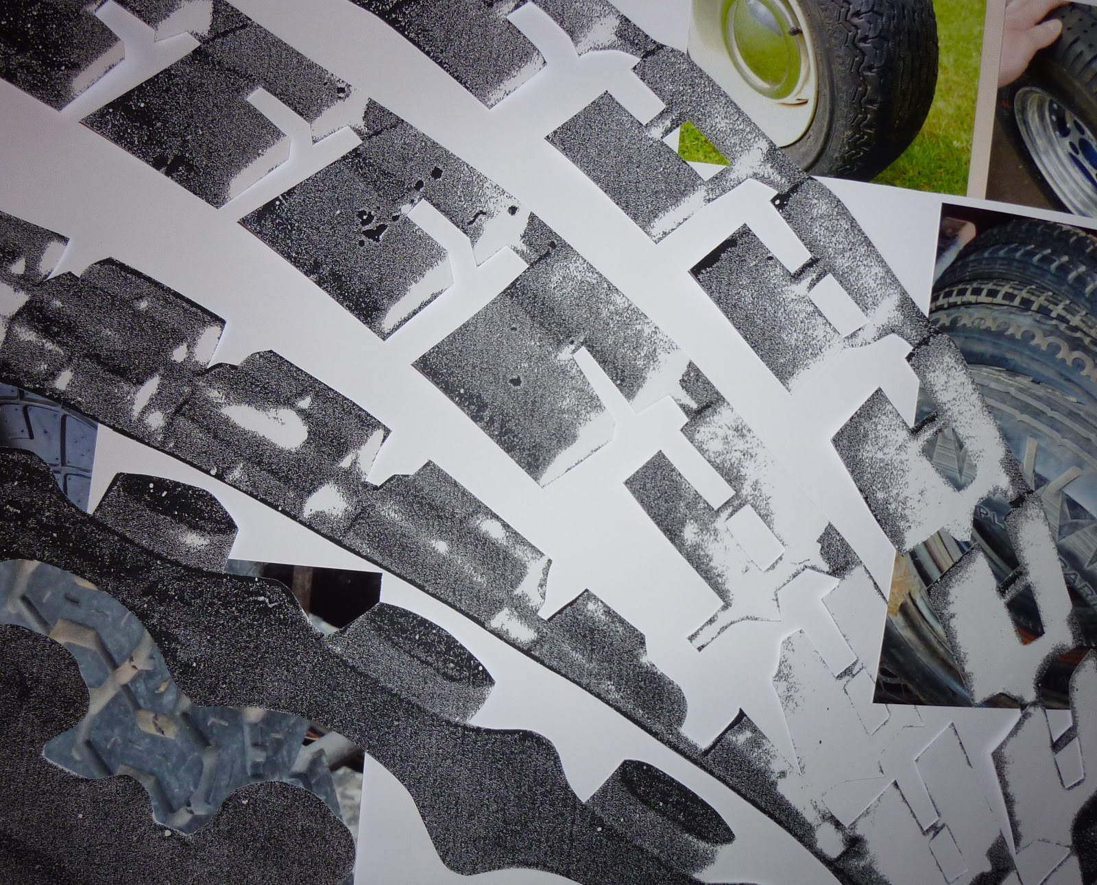
During the paper development stage I thoroughly enjoyed using hand cutting techniques to layer textures with patterns. These are very successful as they are eye catching and I can imagine them being used for large scale pieces in an architectural environment.

Repeat patterns cut either by hand or using the laser cutter work well when overlaying different textures. I will experiment further with this and try using both fabric's and papers to achieve a similar effect.
...After my latest critique I have decided to experiment and sample with plastics and faux leather. As the project has a masculine theme to the imagery, the use of 'masculine' fabrics will create a more sophisticated end result. I will use both shiny and matt finished surfaces to print on and reflect on which methods are most successful. Metallic fabrics and finishes will also be used- including foiling.

Monday 7 February 2011

For the animal in you...

My last project was inspired by animal markings and the theory of camouflage. I'm interested in the patterns within animal coats/ fur and the idea of concealing or distorting an image like camouflage. 

Layering patterns and motif's created depth and extra texture to the fabric.


My giant giraffe added an element of humour to my collection!


...My final wallpaper selection.

I began experimenting with light and playing with concealing a design by using the same colour pigment as the painted background or fabric. This made the patterns easy to see from one angle, but with a change in light it was harder to see when viewed form a different direction...


...I feel this was the strength from this body of work and want to experiment further and develop this technique. I will use foil, flock and devore to trial my idea in my current work.

An Apple A Day...

Second year final project- fruit and veg theme was great fun.

Experimented with scale and textures on paper samples before taking into fabrics.


Show time!
Really pleased with the result of my final collection. The designs worked well together and complimented each other by being professionally presented.


This collection is by far the most enjoyable project to date. Although my current work is becoming a strong competitor.

Sunday 6 February 2011

New and exciting!

After a recent lecture from the very talented Debbie Smyth, I have decided to try and create my first ever blog! This is all new so once I get the hang of it, I will be posting my work (both new and old) and tracking my thoughts along the way, as I carry out my final year at university. Wish me luck!